Planning and Digital Transformation
Power User Guide
Kuali Build Power Users are shaping the foundation of the automated campus at Fresno State. Creating the processes and workflows for student success and providing students with the resources they need to be successful starts here.
The Basics
Kuali Build uses different terminology for common things than you may be used to.
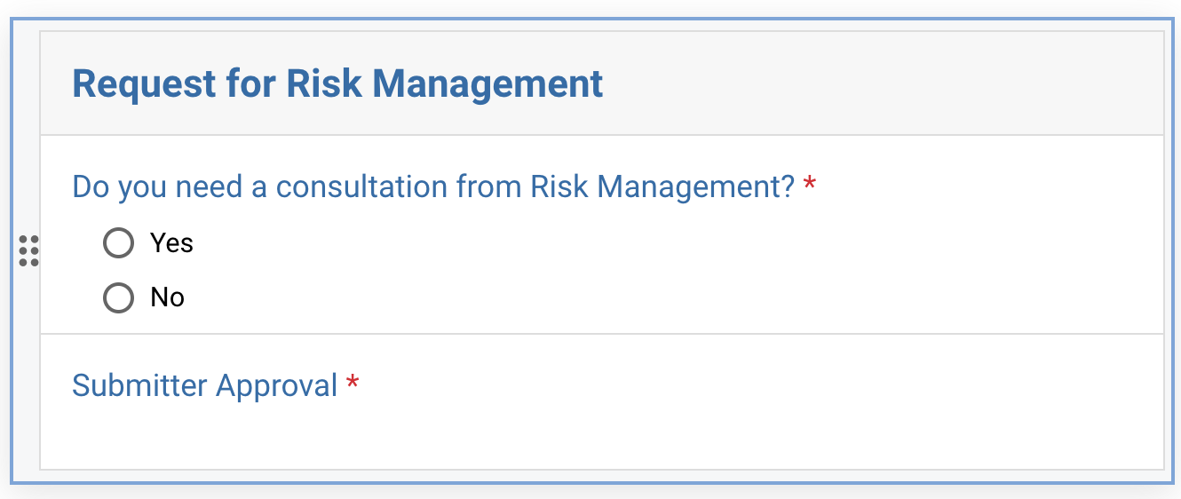
In Kuali Build, submitted forms are called Documents.
A workflow is the series of steps that are taken after a form is submitted. Such as: sending it to a department coordinator for approval. You will frequently see the term app. An app contains a form, the form’s approval workflow, and the submitted responses to that form (documents).
When you want to create a new form and approval workflow in Kuali Build, you’ll create a new app. This contains a blank form, an empty approval workflow, and a space to access and export documents (completed forms).
When you distribute a link to your form and someone fills out and submits the form, in Kuali Build, we don’t say “A user filled out and submitted the form.” Instead, we say “A user created a document in the app” because submitted forms are called documents and they are stored in the app.
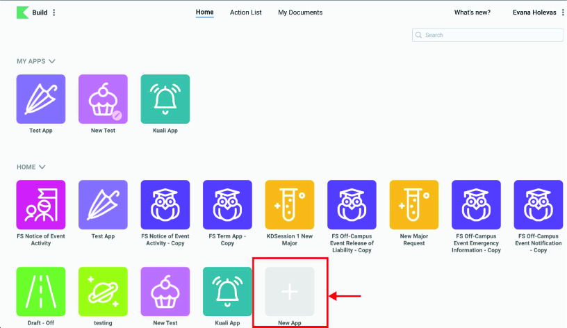
When you first log into Kuali Build, you’ll be taken to the homepage. Here you will see a list of available apps and some navigation options at the top of the screen.
The navigation options are: Home, Action List, and My Documents.
Home: Allows you to view all the apps that are available to you. They are separated by My Apps (apps that you’ve created or have been shared with you), and Home (apps that are available through your organization. You can click on any of the app icons to view or edit them.
From the Action List you will be able to see work items that have been assigned to you and that are incomplete.You may have a red number appear next to the Action List. This number indicates the number of work items you need to complete. You can click on any of the entries to view that document.
My Documents allows you to see forms that you have created. It is divided into two areas: Submitted and Drafts. You can click on any of the entries to view your document.
If you are filling out a form and wish to save it to complete at a later time, click the Save Button located in the top right corner of the form.

To access your drafts navigate to the My Documents Dashboard on fresnostate.kualibuild.com. The My Documents Dashboard can be located by clicking My Documents in the navigation bar located at the top of the page.

Once you are in the My Documents Dashboard you can click the Drafts button to view all your drafts.

Click on a submission to view and complete the form.

App Creation
When you want to create a new form in Kuali Build, you’ll create a new app, which will create a blank form and take you to the form creation screen.
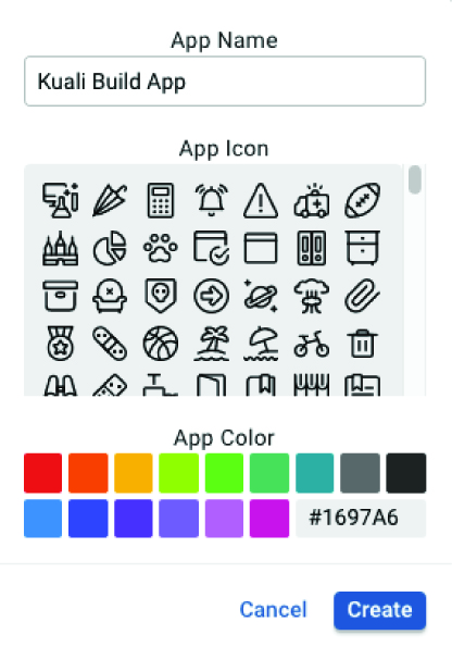
In your Dashboard view, Click the gray New App icon.
A panel will appear prompting you to name your app, select an icon, and select a color. These can be changed at any point in the future.
Form Building
To create a new form in Kuali Build, you’ll create a new app. This creates a blank form, an empty approval workflow, and a space to hold form responses.
Tip: Before creating your form, we highly recommend that you flow out your approval process using a program like Microsoft Visio or Draw.io.
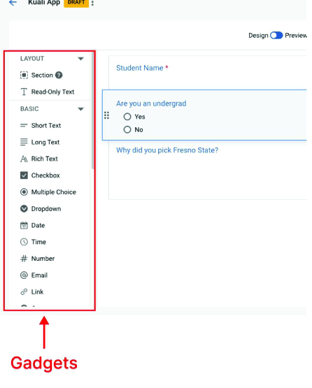
Once you have your workflow defined, you’re ready to create your form. The Kuali Build form builder page has three panels:
The left panel is a list of gadgets you can add to your form. Gadgets are anything
you might put in your form: questions, sections to group those questions together,
and text such as a heading or instructions that you might want in the form.
The middle panel is where you create and preview your form. To build your form, you
will drag and drop gadgets from the left panel to this middle panel.
The right panel has configuration options to customize each gadget. To edit a gadget, you will click a gadget you’ve added to your form in the middle panel and edit the options in this righthand configuration panel.
By default, Fresno State users will need to log in with their username and password before responding to your form. Unless you have set up your form to allow anonymous responses, you don’t need to add a login screen to the beginning of your form – it’s already there!
The left panel is a list of gadgets that you can drag and drop into your form, such as multiple choice questions, read-only text, or section containers (to hold groups of similar questions).
For a definition of each gadget, you can look at Kuali Build’s Form Builder - Gadget Definitions article.
Note: If a form is set up for 'anonymous responses', the data lookup gadgets are disabled
automatically.
To add a gadget to your form:
Select a gadget on the left.
Drag the gadget to the form in the middle panel. As you drag the gadget over the form, a blue rectangle will highlight to show potential locations for the gadget. Gadgets can go above, below, or next to other gadgets – anywhere on the form.
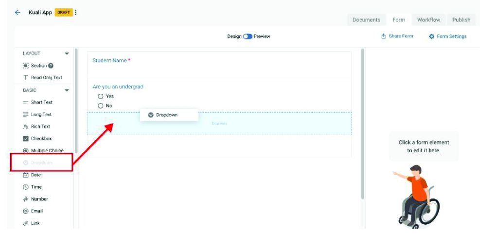
Drop the gadget in the location you desire.
If you would like to move the gadget to a different place in the form, click and hold the gadget to drag and drop it to a new location.
Any time you’d like to edit a gadget, you’ll work in the right-hand configuration
panel.
Note: If you make changes to a form in an app that’s already published, these changes
will not be live immediately. You will need to re-publish your form for your changes
to be live.
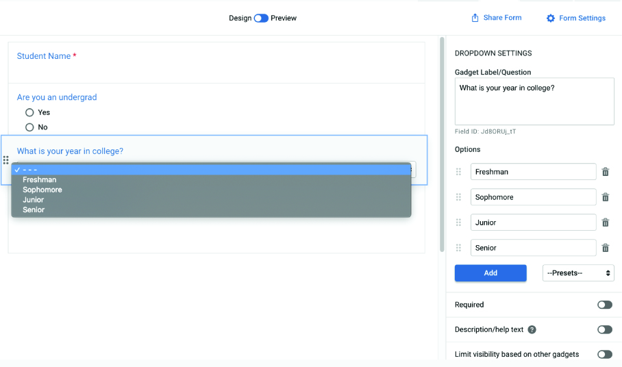
In the form preview in the middle panel, click a gadget you’ve added to your form.
The gadget will highlight in blue.
Once you place the gadget in the form, the right panel will show configuration options to customize the gadget.
If you don’t see options for your gadget, click the gadget so it is highlighted in
blue.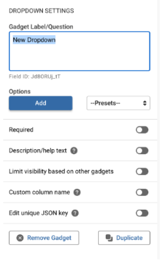
As you change configuration options, the form preview will update automatically.
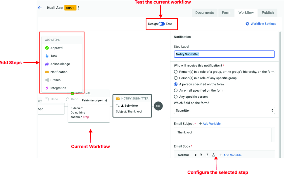
Configuring a Workflow
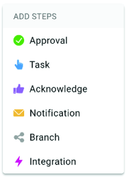
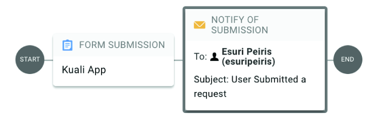
After you have created a form in your app, you’re ready to set up an approval workflow. A workflow determines what happens after a form is submitted, such as emailing the department head for approval or notifying the registrar. You can add these steps to a workflow, in any order you might need them:
Approval – Require a user to approve the submitted form
Acknowledgment - Allows a user to acknowledge that they have viewed a submitted form
Task – Require a user to perform an action, e.g. add information to PeopleSoft
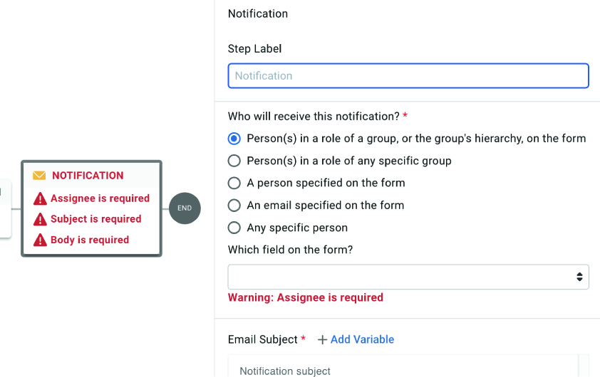
Notification – Notify a user via email of the submitted form
Branch – Set up multiple workflows that route based off conditions from the form (e.g. send
the approval to the biology department OR TSS)
Integration - Select from a list of pre-configured integrations, such as connecting to an API.

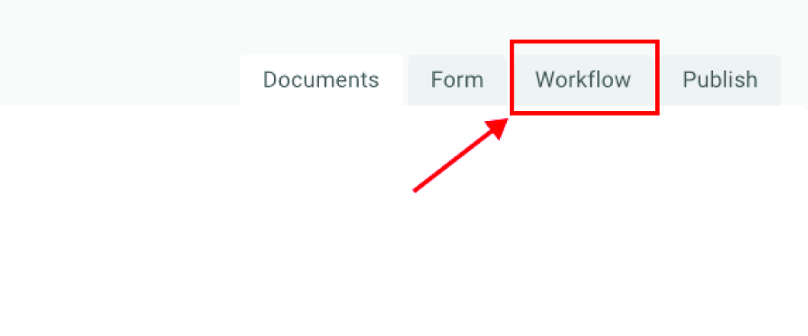
From the Kuali Build home screen, click the app to open it.

Click on the Workflow tab in the top right.
The workflow screen allows you to: add steps to the workflow, view the current workflow,
configure a selected step, and test the workflow by flipping the switch at the top
of the window.
Select a step in the Add Steps panel located on the left side of the page.
Drag the step to the workflow in the middle panel. As you drag the step over the workflow, a blue rectangle will highlight to show potential locations for the step. The first step must be the form submission, but otherwise steps can go to the left or right of any other step.
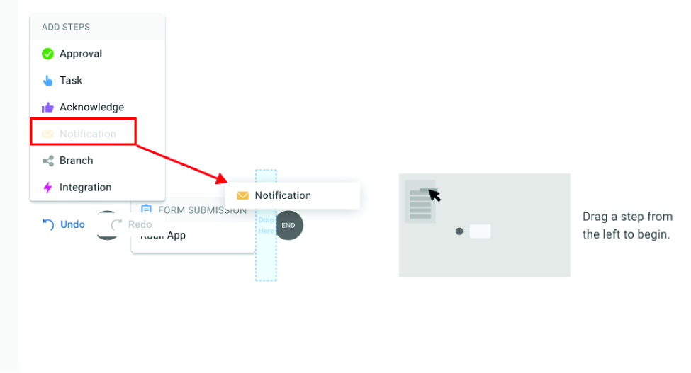
Drop the step in the location you desire. If you would like to move the step to a different place in the form, click and hold the step to drag and drop it to a new location.
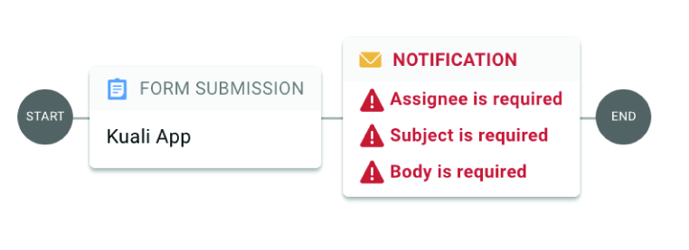
Once you place the step in the form, the right panel will show configuration options to customize the step.
Configure the step. You can always change this later. To save your changes, click
any blank space in the preview section to the left of the configuration panel. The
information displayed in the step will update.
Deleting a Workflow Step
Important: There is no undo! Workflow steps that are deleted are unrecoverable.
In the workflow in the middle panel, click a step you’ve added to your workflow. The gadget will highlight in gray.
At the very bottom of the right panel, click Delete Step.
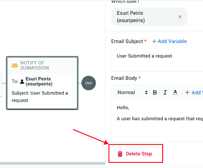
The step will now be removed from the workflow.
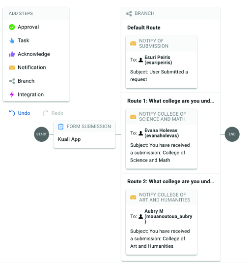
Your workflow can be more complex than a linear series of steps. A branch step splits your workflow into multiple routes based on how a user responds to a question in the form, leading to different steps depending on a condition. For example, depending on what college a student selects on a form, the form can be routed to that specific office.
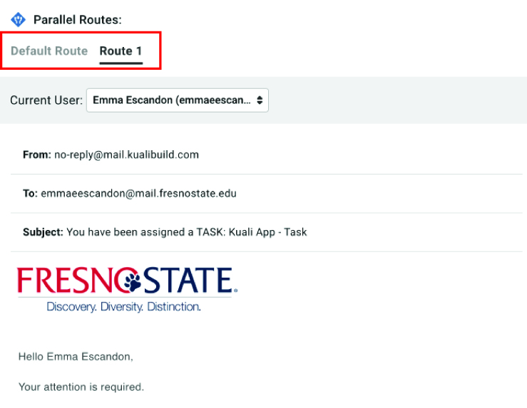
Branches consist of a default route, Route 1, and as many other Routes as you add. The default route is the series of steps that will usually run. Each
numbered route is a conditional series of steps to potentially run instead.
You can create as many branches in your workflow as you need.
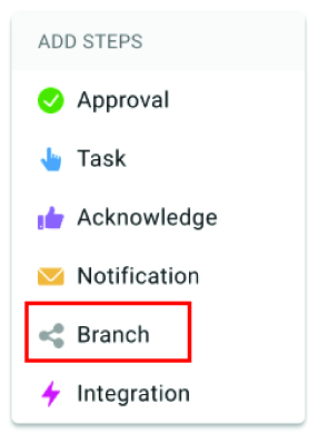
Select the Branch step in the left-hand Add Steps panel.
Drag the branch step to where you’d like it to occur in the workflow.
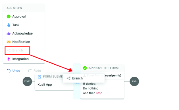
Once you place the step in the form, the right panel will show configuration options to customize the branch.
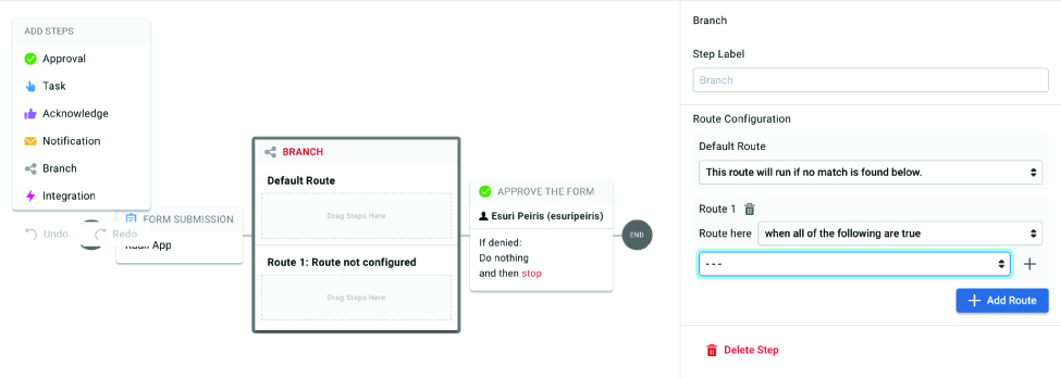
Under Route 1, click on the Route Here dropdown menu and select from the options available.
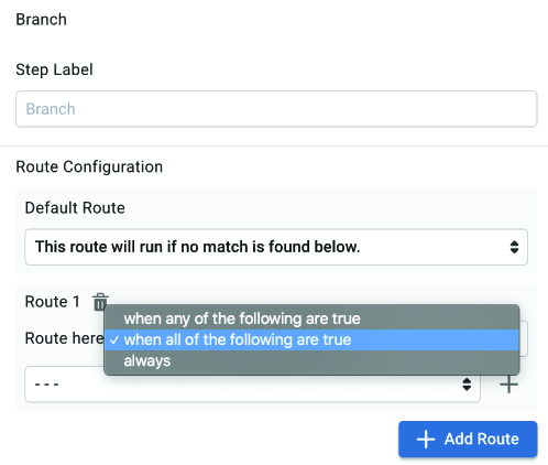
Then, click the drop down below that. You’ll see a list of questions in your form, as well as metadata Kuali Build has collected about the submission. Choose the question you’d like Kuali Build to branch on.
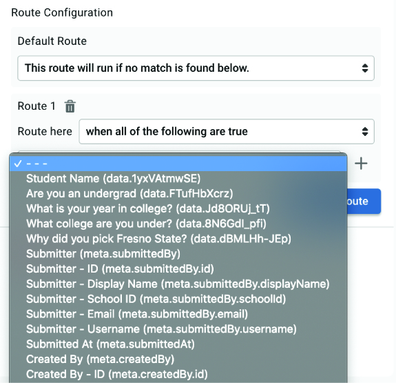
After you select a question, you’ll see a progressive series of dropdown menus. Continue
choosing options until the condition is complete.
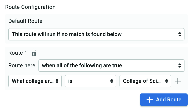
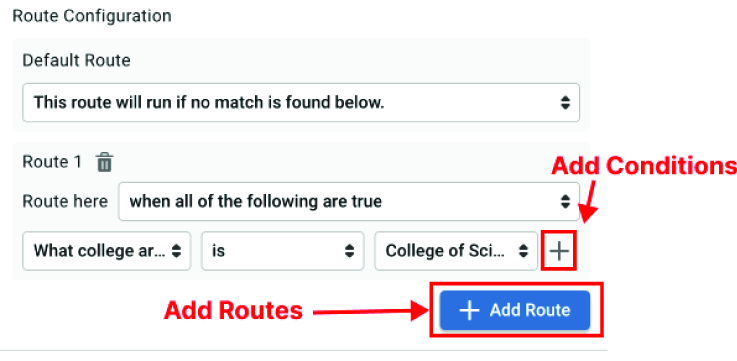
You can also create additional conditions or routes by clicking on the gray plus sign
or the blue Add Route button respectively.
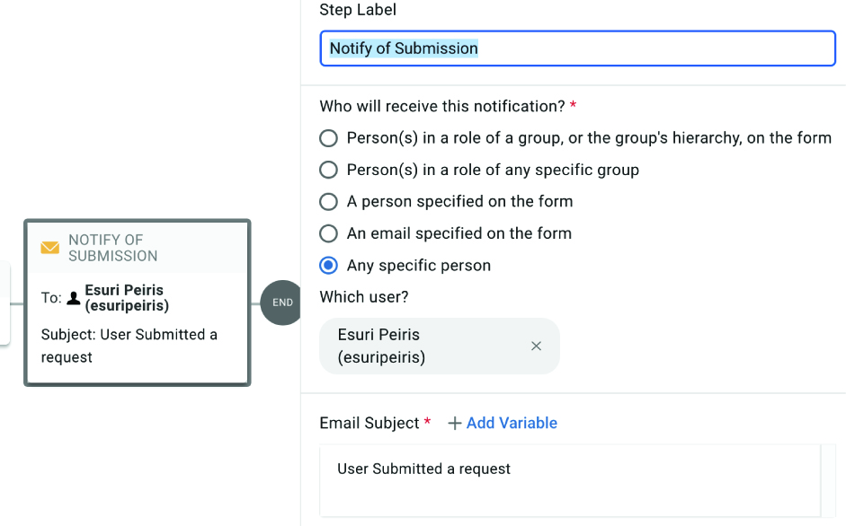
Some workflow steps require entering specific person(s). For example, the Approval workflow step requires configuration of who will approve the step.
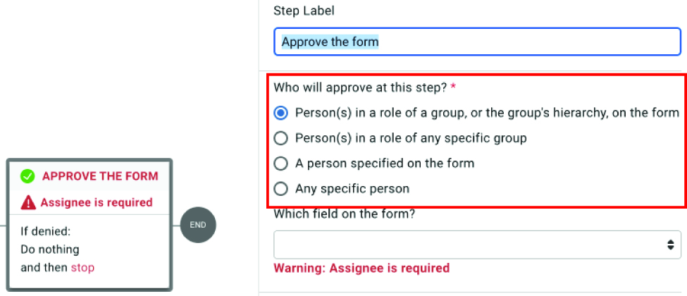
When you select an option from the list, the search field or dropdown below the options will dynamically update. Click in this search field to choose the specific person(s). You have several options here, including pulling from Fresno State’s directories.
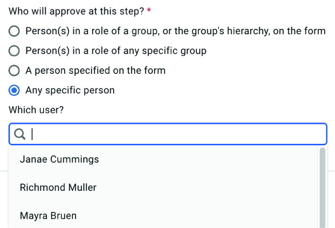
Any specific person: Choose an individual from the directory. Typing in the search field will filter
the dropdown results.
Person(s) in a role of any specific group: Choose specific roles from Fresno State’s departments. Typing in the search field
will filter the dropdown results.
Person(s) in a role of a group, or the group's hierarchy, on the form or A person
specified on the form: These require that you have questions in your form that pull users from the system.
If you have configured any such form questions, the dropdown in this panel will populate
with your relevant form questions.
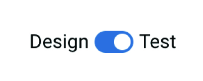
In Kuali Build, you can test the entire workflow. This will not be a live test – emails will not be sent; data integrations and changes such as posting to an API will be mocked but not actually performed. When you test a workflow, you will impersonate various users to see the workflow as that individual.
Toggle the switch at the top center of the Workflow Builder screen from Design to Test.
On the right side of the screen, the workflow simulator will appear. Click Run Test to begin the simulation.
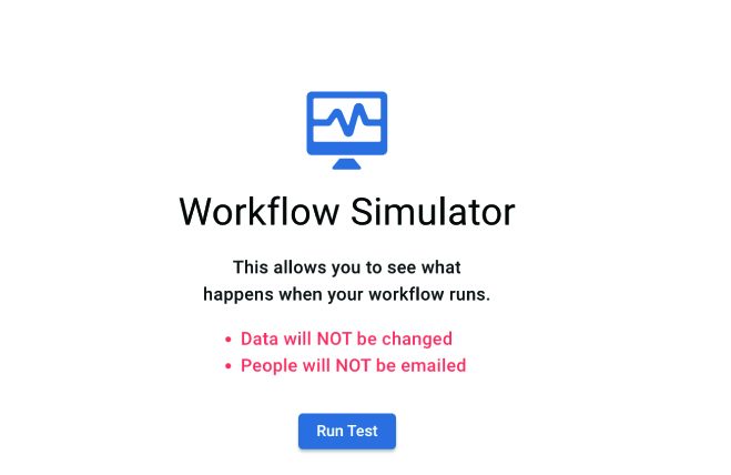
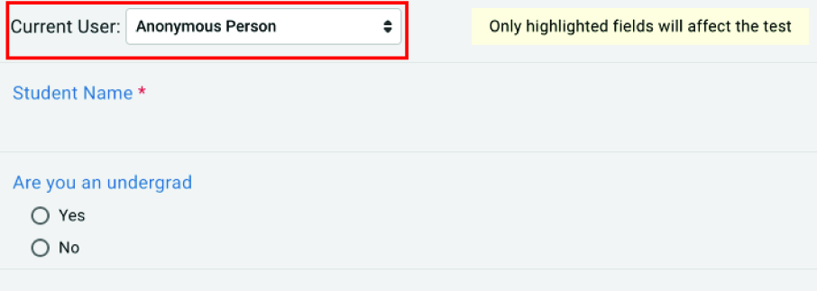
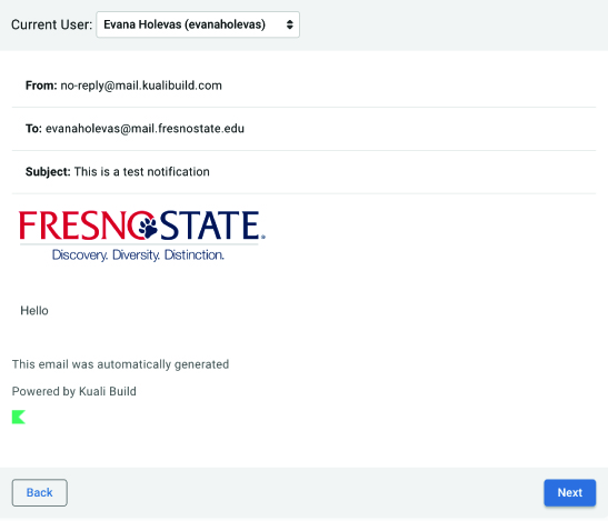
You will see a preview of your form. At the top of the form, click the dropdown next to the Current User to select which user you would like to impersonate. The form will update to reflect what that user will see.
Fill out the form as you’d like, and click Submit in the bottom right.
Kuali Build will go through each step in your workflow and display a preview of what
will happen. For example, if you have a notification step sending an email, Kuali
Build will show you a preview of that email. No part of a test is live, the emails
are not actually being sent.
To go to the next step in the workflow, click Next in the bottom right. If your workflow
contains branches, the test panel will alert you.
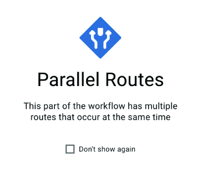
On a panel for parallel routes, when you click Next, Kuali Build will preview the current route’s steps based on the route logic. You cannot preview other routes because Kuali Build is accurately testing this form submission. To preview other routes, you must submit a new test form answering the form questions appropriately.
When the test has gone through every step in the workflow (following the appropriate
branches), the panel will alert you that the workflow is complete.
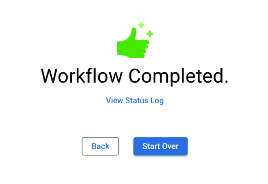
You can click Start Over to perform another test, go back to the previous step by clicking the Back button, or toggle to Design at the top center of the window to continue editing the workflow. You can also click
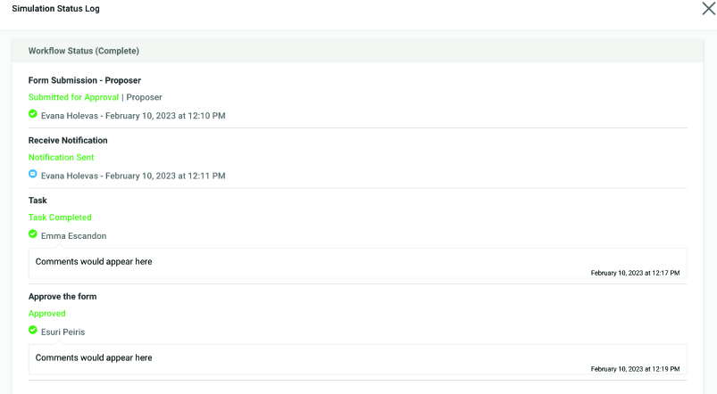
View Status Log to see details of what happened to the form at each stage of the workflow.
Integrations
With Kuali Build, you can connect to different systems like PeopleSoft. You’re also able to give specific users access to your form or pull information into the form about a user. You can also configure integrating with another application or Kuali Build app.
Depending on your specific goal, granting access to users or groups to respond to your form or interact with a submitted form (e.g. as an approver) will be set up one of two ways.
Who can respond to your form? By default, when distributing your form for others to
fill out, the form is inaccessible unless a user is explicitly given permissions.
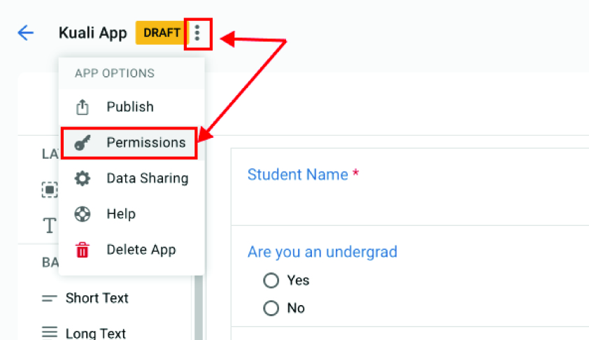
You can grant access for specific individuals or groups by visiting the Permissions screen in the 3 dots menu on the upper left-hand side of the form builder.
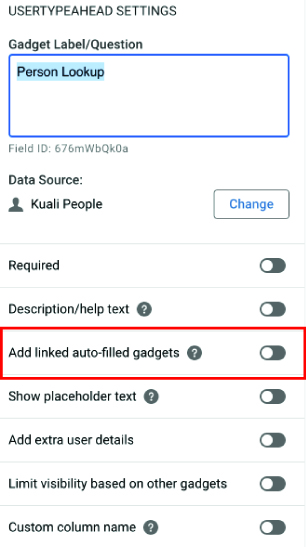
You can pull users, groups, department information, or values from other Kuali Build Apps into your form for questions or as read-only information. You’ll connect to Fresno State information by using data lookup gadgets in your form.
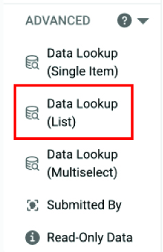
There are three data lookup gadgets:
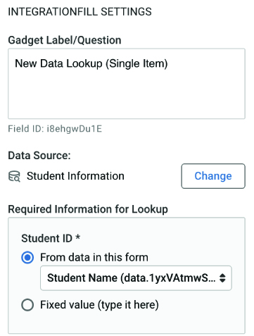
- Data Lookup (Single Item) - This gadget is read only and can search through a specified data source. You may need to provide it with information for lookup by linking data on the form.
- Data Lookup (List) and Data Lookup (Multiselect) are question gadgets that display a list of choices for the user to choose from.
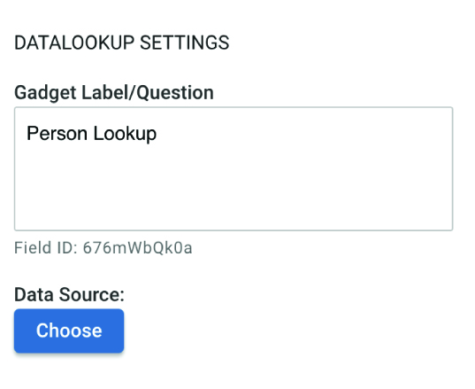
When configuring a data lookup gadget, you will need to choose the data source. This is where Kuali Build will look for information.
For example, let’s add a Data Lookup (List) gadget to our form so our user can choose a single item from a dropdown list.
Add something for the Gadget Label/Question; then, under Data Source, select Choose.
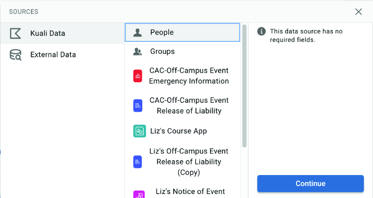
For a data source, choose whichever suits your needs. For this example, we’ll choose
Kuali Data, People, and then click continue. Different gadgets have different data source options.
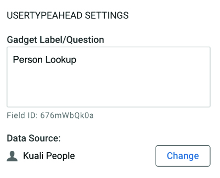
The data source will appear in the gadget configuration panel.
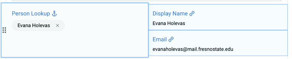
For the Data Lookup (List) and Data Lookup (Single Item), once we’ve added the data lookup gadgets to a form, we can display read-only associated attributes on the form.
Select the data lookup gadget. In the gadget configuration panel on the right-hand
side, toggle the Add linked auto-filled gadgets switch.
Available attribute information will be displayed.
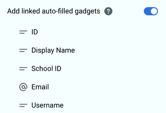
Click and drag any of these options into the form. They will be visible once the user
enters a value for the anchored Data Lookup gadget.
Making your App Accessible
The goal of accessibility is that every person can access your app equally, regardless of how they’re interacting with it. When you finish creating your app, walk through the steps below and implement every step that you can. Any time you make major changes to your app, check the accessibility again.
When you create your section, give it a short, clear, meaningful label. Section labels tell a user what this section will be about.
To update a section’s title:
In the Form Design screen, click the existing section gadget.
The gadget configuration panel will open on the right side of the screen. In the Gadget Label/Question section at the top, enter a new clear and meaningful section label.
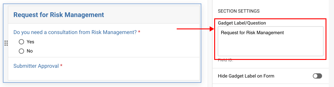
Click anywhere outside of the right configuration panel in the form to save your changes.
At the very beginning of your form, add a Heading 1 title and instructions. The title should be a short phrase describing to a user what the entire form is about. The instructions should include any information the user should know before filling out the form, as well as a contact if they need help.
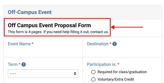
Tip: The section gadget label is not the title! The section gadget label describes this group of question gadgets. The title describes the entire form.
To add a title and instructions:
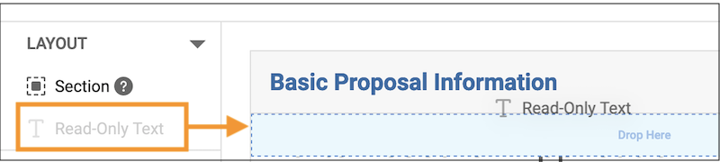
In the Form Design window, add a Read-Only Text gadget to the very top of the first section of your form.
In the right configuration panel for the Read-Only Text gadget, type your title and
instructions on separate lines.
Highlight your title. In the text edit menu, click Normal and change your title to be Heading 1.
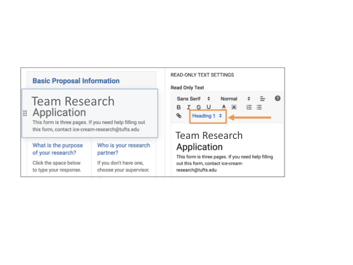
Note: Be careful to make only your title a Heading 1. The instructions should be normal text.
Click anywhere outside of the right configuration panel in the form to save your changes
All text input fields, such as long and short text entry questions, need help text. In Kuali Build, there is no way for the user to identify the input location on Text Entry gadgets, which by default look like this:
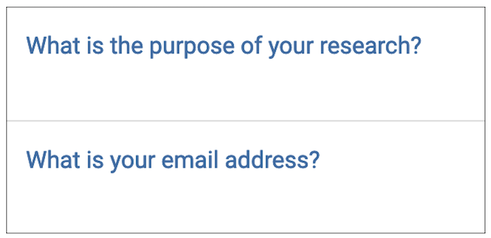
How does the user answer the question? There is no visible input box, no blinking cursor, and generally no indication of where they should type - or if they even can. Instead, you want to add help text to each text entry gadget:
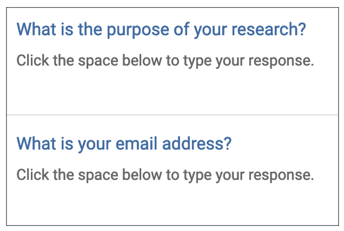
To add help text to a gadget:
1. Click a text entry gadget to open the configuration panel on the right side.
2. In the configuration panel, toggle on Description/help text.
3. Enter help text, such as "Click the space below to type your response."
4. Click anywhere outside of the right configuration panel in the form to save your changes.
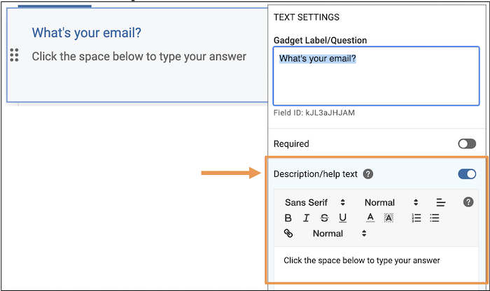
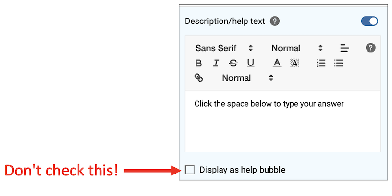
Use description/help text, but don’t display it as a bubble. When adding description/help text, you have the option to display that help text as a bubble. Don't! Here is a comparison:
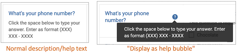
Why not display the help text as a bubble? A common accessibility aid is a screen reader, which reads the screen to the user. If a person is using a screen reader to aid them in filling out your form, the bubble text is read before the question. For example, if you have help text as a bubble as in the above example, the screen reader will read to the user, "Click the space below and enter as format..." THEN it will read "What's your phone number?" It doesn't make sense!
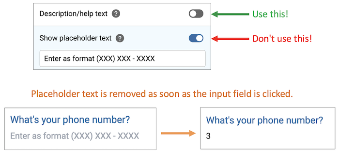
Use description/help text, not placeholder text. When adding description/help text, you might want to use placeholder text instead. Don't! Placeholder text disappears as soon as the user clicks inside the field. If the field had placeholder text the user needs to reference, they now cannot.
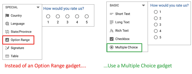
Not all gadgets are accessible. A common accessibility aid is a screen reader, which reads the screen to the user. Kuali Build offers a large number of gadget types, but unfortunately, some of these gadgets are not accessible to screen readers and should be avoided. Below is a list of gadgets to avoid and suggested workarounds.
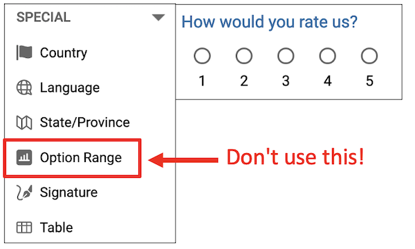
Avoid: Option Range gadget. An option range gadget presents a question to the user and a range of options, such
as 1-5.
Option range gadget problem 1: With option range gadgets, screen readers do not do not read the gadget label. For example, your gadget might be labeled: "How would you rate us? Choose 1, 2, 3, 4, 5" . You would expect the screen reader to read "How would you rate us? Choose 1, 2, 3, 4, 5". However, the screen reader will only read to the user "Choose 1, 2, 3, 4, 5". If you're using a screen reader, how will you know what you are choosing 1-5 for? You won't.
Option range gadget problem 2: When the user has finished filling out the form and is reviewing the form before
submission, the gadget label is not associated with the answer options. The screen
reader will not read, "For the question How would you rate us?, you chose 2." Instead,
the screen reader will only read, "You chose 2." What did the user choose 2 for? There's
no way to know.
Option Range gadget workaround: You can use a multiple choice gadget to present the same question and offer the same options.
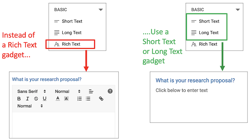
Avoid: Rich Text gadget. A rich text gadget is a gadget where the user can enter text that they can add formatting to - making their entered text bold, pink, underlined, cursive, etc. Rich text gadgets have an accessibility issue identical to option range gadgets.
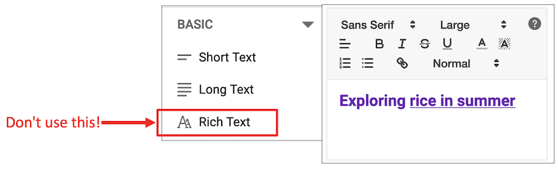
Rich text gadget problem 1: With rich text gadgets, screen readers do not do not read the gadget label. For example, your gadget might be labeled: "What is your research proposal?" You would expect the screen reader to read "What is your research proposal? Enter text.". However, the screen reader will only read to the user "Enter text". If you're using a screen reader, how will you know what you are entering text for? You won't.
Rich text gadget problem 2: When the user has finished filling out the form and is reviewing the form before
submission, the gadget label is not associated with the entered answer. The screen
reader will not read, "For the question What is your research proposal?, you entered
Exploring Rice Growth in Summer." Instead, the screen reader will only read, "You
entered Exploring Rice Growth in Summer." What did the user enter that answer for?
There's no way to know.
Rich text gadget workaround: You can use either a short text gadget or long text gadget for the user to enter
text.
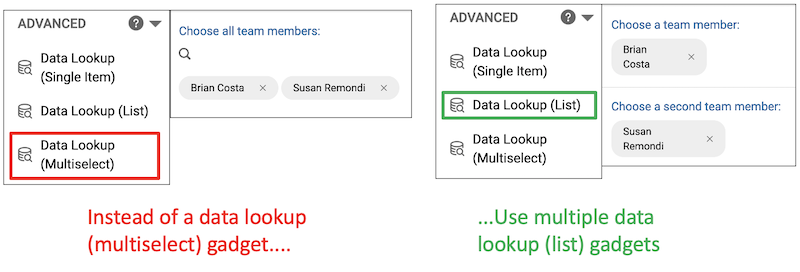
Avoid: Data lookup (multi-select) Gadget. A data lookup (multi-select) gadget is a gadget connected to a data source, such as a list of all users at the university or a list of all departments, where the user is presented a list of choices and can choose multiple options.
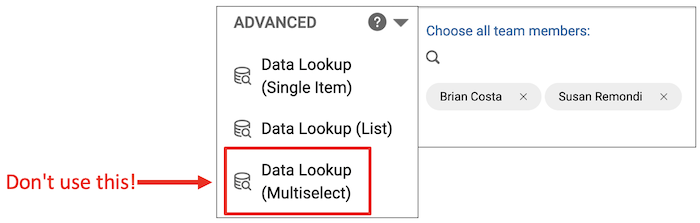
Data lookup (multi-select) gadgets problem: With data lookup (multi-select) gadgets, all choices are unlabeled to screen readers, meaning a user cannot review or know what they've already selected. For example, if a user chooses Brian and Susan from the gadget, the screen reader does not read, "You have chosen Brian and Susan." Instead, the screen reader reads "You have chosen Unlabeled and Unlabeled."
Data lookup (multi-select) gadget workaround: You can have many Data Lookup (list) gadgets for as many options as the user may need.